
The Ultimate RevOps Dashboard
What Makes a Good RevOps Dashboard?
Most revenue reporting displays historical data. Better reporting shifts from lagging to leading indicators. And the best reporting enables metrics to be interactive, so staff can perform What-If modeling and scenario planning.
A good RevOps dashboard focuses on the most essential role-based key performance indicators (KPI). It prioritizes KPIs based on importance or timing. And it brings real-time visibility to progress and variances.
It delivers the greatest value when it advances from statistics to insights, KPIs to KFIs (key future indicators) and static to interactive.
So, how do you create a good Revenue Operations dashboard? It's a 3-step process.
How to Create a RevOps Dashboard
Define and Categorize the Most Important Metrics
The first step is to define the performance metrics that most impact customer acquisitions and continued customer growth.
That's done by surfacing the KPIs at each step of the customer journey. And as any experienced revenue operations consultant will advise, you need to align the buyer's purchase process with the seller's sales process and define performance measures for both.
Customer journey maps vary by industry and company. An example is shown below.

You should group metrics into the four categories of Volume, Conversions, Time and Value. This will make it easier for readers to consume information.
I've written about the four categories of RevOps metrics elsewhere so won't repeat that here.
Transform Data into Insights
Many business leaders are data rich and information poor. Revenue analytics can fix that. But first, data must be converted into actionable insights.
"Data is the new oil. And like oil it's only useful when it is refined." — Jess Greenwood
A data transformation process can systemically transform data into insights, and then into actions that deliver outcomes.
The below diagram shows how this process can be automated.
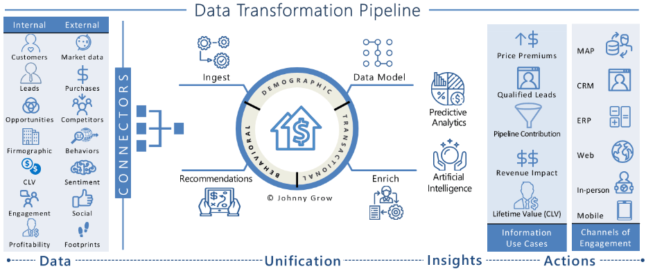
When creating data transformation pipelines for clients, we typically use tools in a RevOps tech stack.
These tools define the methods to acquire, integrate, store, secure, deliver, manage, monitor and measure the value of data. They also include data rules such as structured formats, naming conventions and data properties.
Data offers a use-it-or-lose-it proposition. It is a powerful asset if converted to information and made actionable. Or it's a cost without benefit if left idle. And for the most part, it doesn't get better with age.
Visualize Insights in an Easy to Consume Interface
The best Revenue Operations dashboards take a less is more approach. They focus on fewer metrics to drive more action. Experienced revenue operations consultants know that adding more measures clouds what's most important and quickly results in diminishing returns.

Revenue Operations dashboards rated as ineffective are often described by staff as all show and no go. They may be visually appealing but fail to gain user adoption as they don't really display anything that helps staff improve performance.
On the flip side, dashboards rated as effective are less about displaying content and more about making the information actionable.
The most successful businesses are defined by their ability to collect and curate the right data, use data to create differentiating customer experiences and apply analytics to make insights actionable at every customer interaction or decision point.
Some Helpful Insights
To a first-time observer a Revenue Operations dashboard may look good. But if good looks were the criteria for success my first marriage would have made it, and these dashboards would get much more utilization. Research from the Sales Excellence Report shows that they achieve 30% utilization following go-live. But within 3 weeks that utilization falls to 9%. Over time it falls further. The decline is due to reporting that doesn't provide real help to users.
The good news is that the challenge can be remedied. For example, we know information must advance from being merely interesting to inducing action. We also know the six ways to make data actionable include the following:
- Make the most important metrics highly visual
- Align performance metrics with company outcomes
- Show KPIs alongside budgets or industry benchmarks for context
- Shift from lagging to leading KPIs
- Allow the data to be interrogated, manipulated and used for predictive analytics, and
- Link the data findings to recommended actions such as a Playbook
Each of the above best practices creates a shift from data-driven to insights-driven information. This then shifts revenue operations to revenue acceleration.
The More You Know the Faster Your Grow
You can't manage what you can't measure.
Driving improvements to customer acquisitions and continuous customer growth starts by bringing real-time visibility to the most influential metrics.
Dashboards are a top delivery tool to get the right information to the right person at the right time. They display the most important KPIs in an easy to consume visual interface. They make it simple for staff to quickly identify trouble spots and intervene with timely course corrections.
An interesting thing about a revenue operations dashboard is that staff spend less time accessing information reporting and more time making changes to their processes. That's the sign of successful reporting. If the information is causing operational changes to be made, it's working.
When building these dashboards for clients, I often get asked how many metrics should be included on a RevOps dashboard. The answer is always the same, as many as will get acted upon.